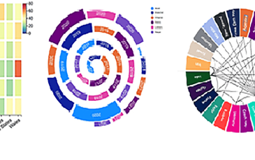
- Charticulator in Power BI #728th June 2021Using Two Categorical Axes. In my very first post on Charticulator, I urged you to forget everything you currently know about creating conventional charts. Instead to think in terms of designing a representation of your data, where you’re no longer...
- Charticulator in Power BI #624th June 20212D Region Plot Segments Part 2 – Sorting, Spacing, Aligning etc. In my last blog post, we delved into the mind-bending world of plot segment sub...
- Getting formatted text into your Power BI reports24th June 2021Hi I’m Alan, a new name here at Burningsuit and this is the first of what I hope will be many Blog posts from me. Recently I was talking with a client...
- Charticulator in Power BI #521st June 20212D Region Plot Segments Part 1 – Sub-Layouts. In my last post I showed you how to create a line chart using a symbol as your glyph. You also learned...
- Charticulator in Power BI #4.18th June 2021Using Symbols & Y-Axis Weirdness. If you’ve been following along with my earlier posts on Charticulator, it may not have escaped your notice that I’ve...
- Charticulator In Power BI #3.11th June 2021Binding Data. In my last post, we took a tour around the Charticulator screen and learned about the Attributes pane which lists the attributes of the...
- Charticulator In Power BI #2.9th June 2021Taking a Tour Around the Screen Since my last blog post, I’ve been looking more closely at some of the resources “out there” if you want to learn...


